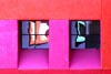
My fave. What's attractive here, obviously, are the outrageous colors; the reflections in the windows are recognizable enough to be interesting and they provide some additional colors as well. Then there's the composition. You lined up everything very well, which was tough to do at La Placita. The windows weight the image to the right, but that weight is balanced by the wider column on the left. In other words, you've got windows more to the right, but the column on the right is skinny; you've got less window-age going on on the left, but the column is thicker. Would the photo be better if the bottom horizontal part were thicker (to form an "anchor") and the top thinner to let the photo "float" up? I dunno -- I'd have to flip it upside-down, I guess, to see. Beautiful shot. Wish I'd taken it.
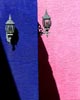
Equally superb. You've got repeating elements in the two columns, the two shadows, and the two lamps. You've got the Rule of Thirds going in that you've got THREE discrete elements -- lamps, shadows, vertical rectangles. Very bold. Very dramatic. Very dynamic. I won't mention the black zit there in the pink wall just to the right of the lamp -- if you were to make a print or a notecard of this, you may wish to clone it out. Wonderful simplicity here. Very well done.
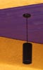
Although I consider this your weakest shot of the bunch, I like your thinking here. You've got some good diagonals going on, complementary colors in the purple and yellow, some semi-triangular forms, good layers, everything tied together by the black lamp. So what's the problem? I'm really not sure . . . maybe because there's not enough detail in the lamp? Maybe because the colors are a bit murky? I'm having a problem putting my finger on it . . . yeah, I think it's just the lamp. If the lamp were round, would that make the shot better? Not necessarily. If it were bright red? Okay, THEN I think we'd have more drama. So maybe it's just the dark, foreboding nature of the lamp against the relatively dark colors. I don't know and I think I'm just going to shut up now . . .
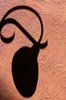
Not critiqued.

Not critiqued.