From: caroleigh@c...
Date: Wed Mar 9, 2005 7:35 pm
Subject: Critique: CJ Middendorf (Angle of View - 4 photos)
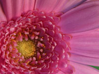
Daisy Front - Classic composition going on here, with
the main focal point being in the lower left. Everything radiates out
from that point, giving our eye something to do. The colors are good and
I like how you have that little bit of dark green peeking between the
petals. The only thing bugging me a bit is that the photo looks a bit
murky. But then I say that a lot, so I was wondering is it me sounding
like a broken record, or is it a valid comment? So I brought your photo
into Photoshop and by adjusting the levels a bit and using the dodge tool
to slightly lighten the yellow center,the photo seemed to pop a bit more.
I uploaded my version into your folder, and hope that you don't take offense.
It could probably be even better if you were to take some time with it.
I just did a quick in and out to see if my "murky" comment was
simply a hallucination. It wasn't. I think I know your lighting setup,
CJ, and know the lights that you're working with. I'm using the same or
similar here in my studio, and I have to be very careful when bringing
my photo into Photoshop. I look at it "as shot" but then I also
look at it using the "tungsten" selection and the "fluorescentselection,
etc. And I do this even though I'm shooting RAW, AWB. Sometimes it's fine
"as shot," but other times I like how it looks in different
settings.
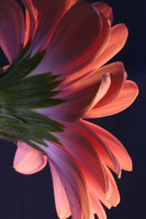
Daisy Side - Very dramatic. I like the dramatic lighting,
the dark background, the way the front of the daisy is lighted, the light
coming through the petals there at the bottom, the suggestions of light
there at the upper left. Subtle yet bold. Delicate yet strong. [Insert
more oxymorons here . . .] It would have been easy for you to have underexposed
the darker elements on the left side of the photo, but they're visible
enough to add interest as well as balance to your shot. Beautiful. This
will make a good greeting card!
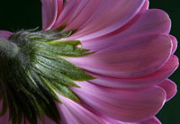
Daisy Upside Down - I don't know about this one . .
. I'm thinking that there's not quite enough interest in the "base"
of this daisy to hold our attention. What if you had tilted your camera
down and slightly to the right? You'd be cutting off some of the more
boring base-age and incorpoating more of the petals as a result and I
think your photo would be more interesting.
Daisy From Below - A good companion to your "Daisy
Side" photgraph! Again, dramatic light, dark background, enough light
to set off all the petals, make them separate from one another. The one
pink petal that's there directly to the left of the stem sort of bothers
me, but, if you were to lighten the area to the right side of the base,
is there any pink there that might balance it? No even if there were,
that one rogue petal would still be distracting . . .
Your photos are getting better and better. You're paying more attention
to light and shadow, and you're filling your frame nicely. (Rich probably
agrees, but I'm talking *photography* here!).
Carol Leigh